This whole series was based around people that blend into their environments. Most are my friends when they played at the Phoenix Theater in Petaluma this weekend, or just other random shots I got. I used a Canon T3I rebel mostly on 1/200ths on 3.4ƒ or 5.6ƒ.
Sunday, October 5, 2014
Thursday, September 25, 2014
Balance, Symmetry and Asymmetry
Asymmetry
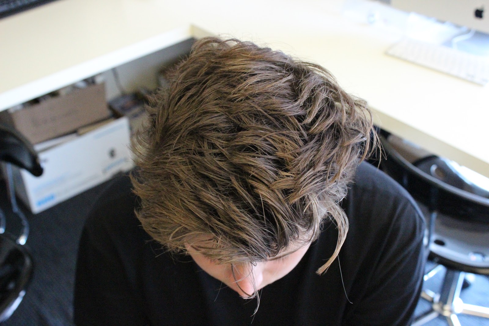
I really like this photo because the background is pretty symmetrical, as well as his face and posture. The only thing that is Asymmetrical is his hair, which is what the picture is mainly focused on.
This photo had no symmetrical value or balance to it whatsoever.
This photo is great because everything is so lined up, but nothing is symmetrical.
This one is nice because the line of focus is straight down the middle.
This photo is nice because it has a rule of thirds going on.
Balance
This photo is a great example of Balance because of the subjects. There's 2 subjects on the left, some negative space in the middle, and 2 subjects on the right.
I liked this one because the ruffles of the curtain are only shown on one side of Khan, with Isaiah to balance it out.
I really like this photo because Ade is obviously a tall guy, and Kasani isn't, and Cora is in the background to balance the photo.
This was taken when I crossed the street right before it changed and everyone had to wait because no one here would ever jaywalk. The sidewalk provides a line to focus on, with cars on the left and everyone on the right.
This is great because Ade is on one side, and Kanye is on the other side and it balances really well.
Symmetry
Ade did not have a sweatshirt on that wasn't symmetrical.
BasedGod here strikes a pose that makes him equal on both sides.
This was really great to find a symmetrical plaza. I was happy that all the lines turned out straight.
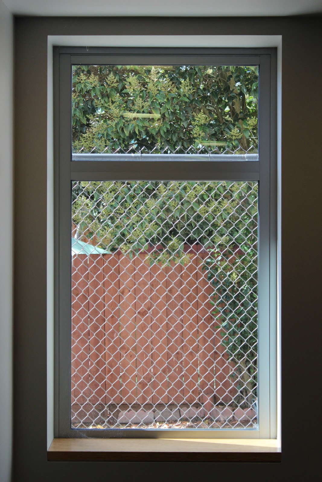
This window is in the basement. The chainlink fence really makes it.
I really liked this one a lot. It mainly focuses on symmetry (the gates) but also uses balancing a bit.
Thursday, September 18, 2014
Arrangement of Lines
There are lines all throughout this photo, particularly from the circle in the bottom left. They point to the drain and the shadows in the top right corner.
The pipes on the roof mainly point to the doorway, and the lights in the hall.
This is a less apparent version of lines. the lines point around to the brass-colored valve on top, and the guage.
I specifically liked this photo because it was like there's a mirror in the middle of the picture. There are lines everywhere. The handrails going up and down, the stairs, and even the tree on the outside.
In this photo, there are lines all pointing to the windows and the little vents on the side of the building.
This photo incorporates rule of thirds and the lines pointing every which way on the wall, between each differently sized brick.
I like how the lines change pace right in the middle of the photo. The lines seem to point to the lines in Kyle's shoes.
Trees are always great for finding lines. The branches all point to leaves and other branches.
The curbs in the middle of the street point to max, and the scaffolding seems to point to the over-exposed building.
As Mr. Whiton said, the muni power lines are always going to be good for line projects. The cables are pointing to the constructions sight and the sky,
This photo also has some rule of thirds, and the lines between the bricks. It points to that out of place red marble piece, and the wheelchair accessible sign.
I thought the lines of stucco on the house and the cords on the side of the building intersected, some pointing to the ground, some pointing to the sign or the car.
I took this photo right out front of drew. The curb and the lines of bricks seem to point to the man with no shirt, who is arguably the center of attention in the photo.
The whole street in and of itself is a line, along with the divider in the middle. It might not be as apparent at the others, but I still thought it was nice.
For the final photo, the ledge is leading up to Max's shoes. It could also lead to the plants or the Fire Alarm Box.
Thursday, September 11, 2014
Light Composition

In this photo, I used a can and my iPhone's flashlight. It really accentuates the rust marks at the bottom of the can.
This is a can of pringles. I really liked the way it fades into the background, like there are no real edges.
This is the same can of pringles. I went for a different approach this time, making sure all the edges were apparent while the background was not.
The object is a kind of old timey oil lamp with a bottle opener in the top. The edges are clear, but the object seems to be in the shadow.
This is the same object, just with more light and another object in the frame. It is a very clear picture, with lots of detail.
This is the same picture, but uncropped. It makes it look like it's deeper and less accentuated.
This is also the same photo, just with color this time. The red pops out a lot from the gold color, and makes the photo a lot more accentuated than the others.
This photo is Max's shoe with his phone in it. It glows against his phone and through the shoe itself. The thing about this photo is that you can tell what's there but you can't really see it that well.
Subscribe to:
Posts (Atom)