Asymmetry
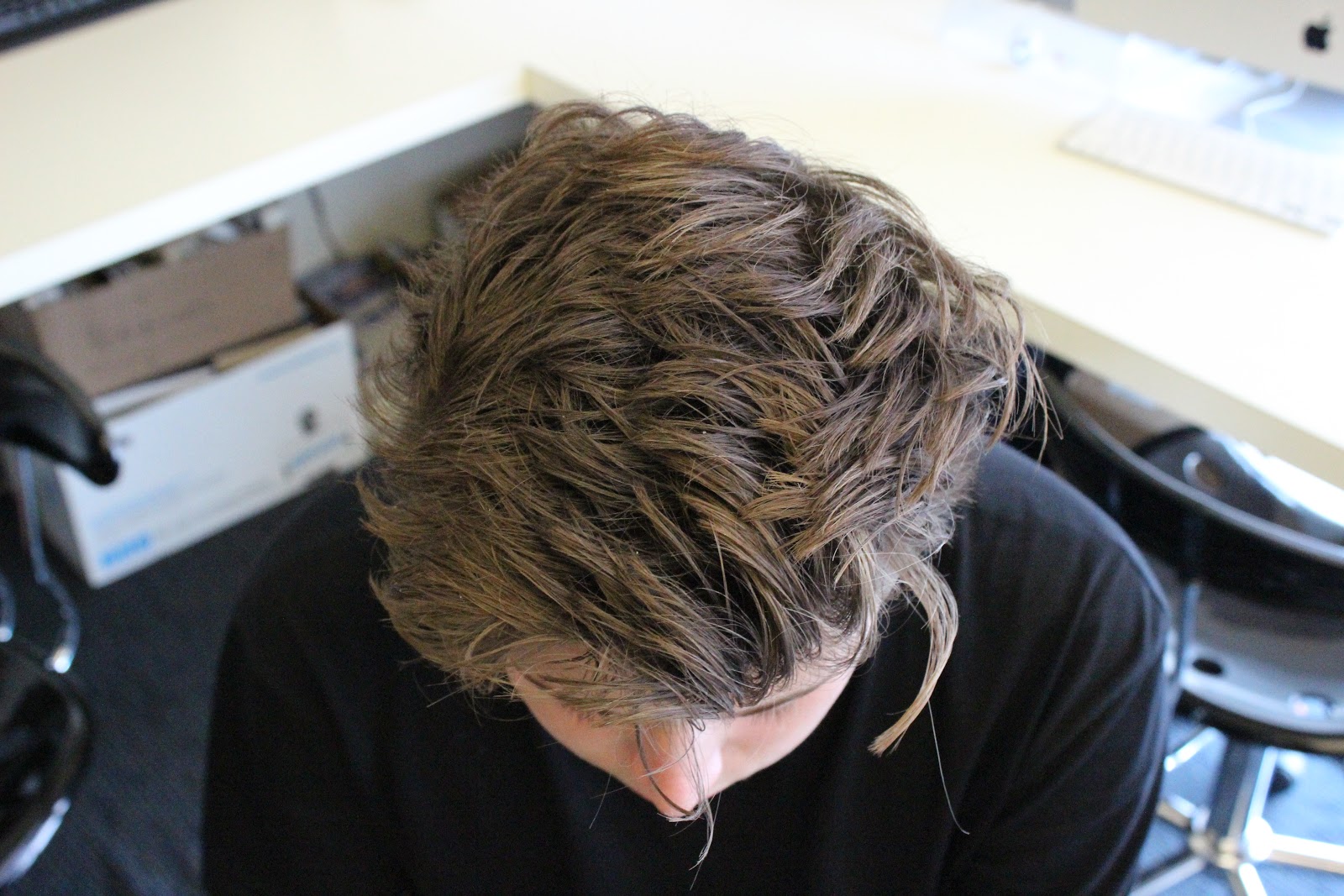
I really like this photo because the background is pretty symmetrical, as well as his face and posture. The only thing that is Asymmetrical is his hair, which is what the picture is mainly focused on.
This photo had no symmetrical value or balance to it whatsoever.
This photo is great because everything is so lined up, but nothing is symmetrical.
This one is nice because the line of focus is straight down the middle.
This photo is nice because it has a rule of thirds going on.
Balance
This photo is a great example of Balance because of the subjects. There's 2 subjects on the left, some negative space in the middle, and 2 subjects on the right.
I liked this one because the ruffles of the curtain are only shown on one side of Khan, with Isaiah to balance it out.
I really like this photo because Ade is obviously a tall guy, and Kasani isn't, and Cora is in the background to balance the photo.
This was taken when I crossed the street right before it changed and everyone had to wait because no one here would ever jaywalk. The sidewalk provides a line to focus on, with cars on the left and everyone on the right.
This is great because Ade is on one side, and Kanye is on the other side and it balances really well.
Symmetry
Ade did not have a sweatshirt on that wasn't symmetrical.
BasedGod here strikes a pose that makes him equal on both sides.
This was really great to find a symmetrical plaza. I was happy that all the lines turned out straight.
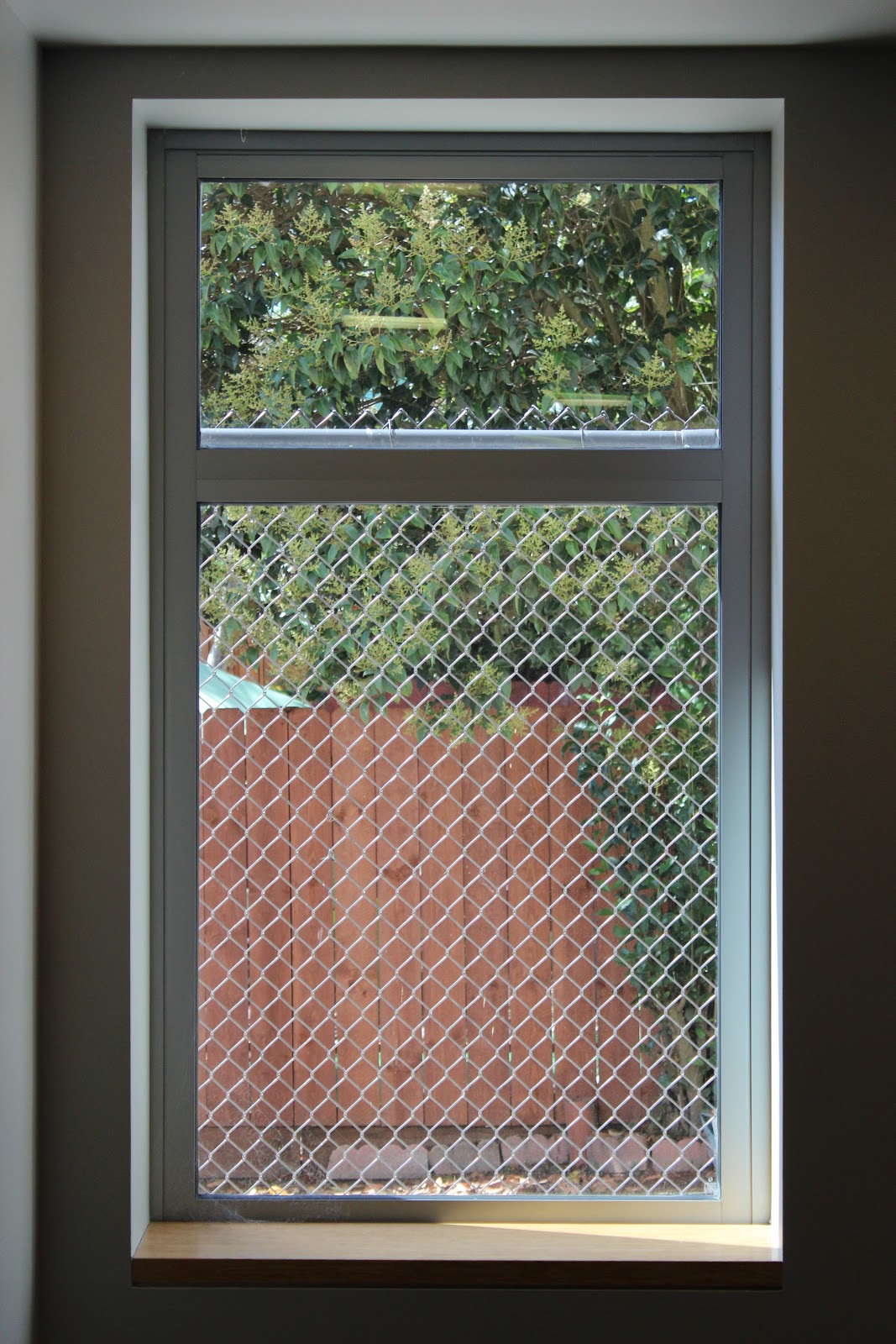
This window is in the basement. The chainlink fence really makes it.
I really liked this one a lot. It mainly focuses on symmetry (the gates) but also uses balancing a bit.


I love the way all these photos are different form each other, some of photos don't work perfectly, but the idea was there. I like the second balance photo the most.
ReplyDeleteI like how there is a lot going on in each photo, none of them are too simple
ReplyDeleteI really like how you used people to exemplify each type of photo. I think it was a unique way of going about completing this assignment. Good Job!
ReplyDeleteI like the photo of Ade and I because our heights almost balance the photo out. I like how you add a little line with each photo its pretty funny, but you might want to consider writing a description for the assignment and what you learned, and then just let the photos speak for themselves. Good work regardless.
ReplyDelete